Judging Books By Their Covers
Occasionally I like to read through upcoming book previews like this recent one from Gizmodo and decide whether I want to download a sample based solely on the one or two sentence blurb and the cover.
Then it occurred to me that I can turn this exercise into easy, low-brainpower blog content while simultaneously revealing how irrational and shallow my book opinions are, so here you go.

Cover: I like the composition in its entirety, but it does follow this recent trend of flat, engraving-esque, overly-detailed fantasy covers that I’m not a fan of. They got away with it this time, but I’m still not happy that this has become so common. Oh, and I don’t like that horizontal bar cutting the image in half across the middle.
Blurb: Sure, that sounds cool. I’m all for revolutions and cursed cities. However, this was written by Adrian Tchaikovsky, whose Empire In Black And Gold I did not like at all.
Sample? It’s close, but I’m going to say Yes

Cover: Nooooooooo. Not another Song Of Achilles coat-rider, a full third of the new releases section looks like this, enough already.
Blurb: I have a possibly-irrational dislike of anything to do with Greek or Roman mythology, so this is a total non-starter for me. It doesn’t help that I have no idea who Clytemnestra is.
Sample? No

Cover: Kind of boring, does nothing for me.
Blurb: In addition to Greek and Roman mythology, I also don’t like dragons because they’re way over-used in fantasy. Dragons that can turn into humans are a little more interesting, although the premise reminds me strongly of this book I read ages ago with a similar premise, which wasn’t very good.
Sample? Eh, no.

Cover: Leans a little hard on the orange-and-blue thing, but otherwise it’s pretty striking. I like it.
Blurb: Interesting dystopian premise, seems like it has vibes. The only thing tripping me up is that it’s by Justin Cronin, author of The Passage, which is awful.
Sample? Sure, why not

Cover: It sure is a horror cover.
Blurb: Yay for horror, on the other hand it sounds like a slasher story which I’ve never been a fan of in movies. But maybe teens getting picked off by a killer will be more interesting in literary form?
Sample? Sure why not

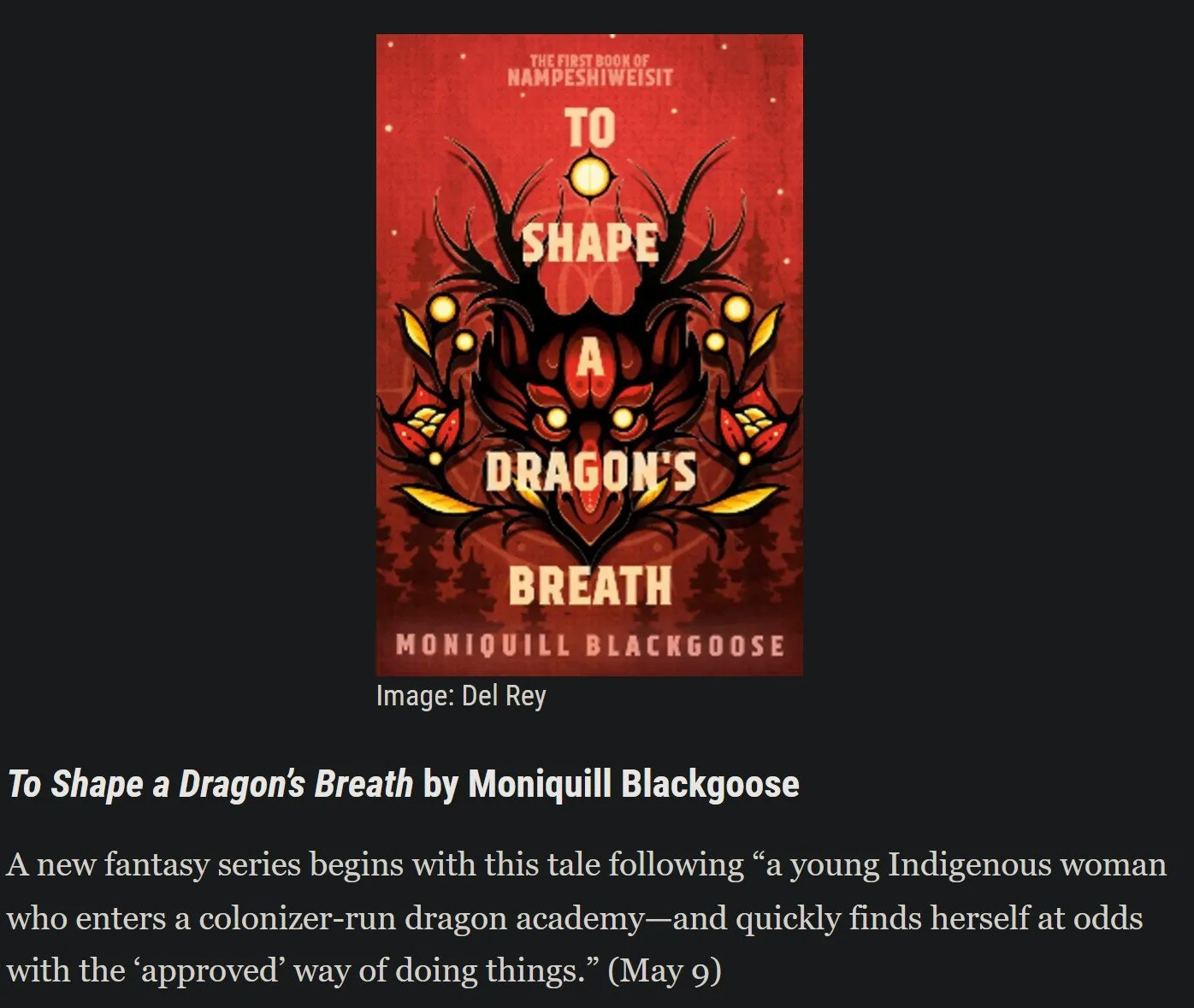
Cover: It’s not terrible–check out those sick dragons on the pages–but my eye also slides right off of it
Blurb: Believe it or not, this is one of two books about girls going to dragon-riding school on this list. The second one seems marginally more interesting, but nothing about this grabs me at all.
Sample? Nope

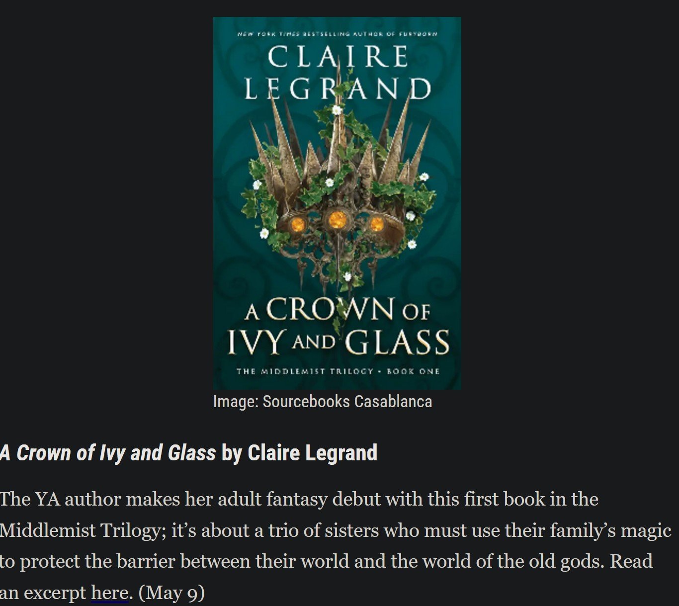
Cover: I quite like this. Maybe a little too dark, but it’s a good design. Not really a big fan of the title treatment.
Blurb: Norse mythology is a little better than Greek and Roman (I like the aesthetics), but still not something I find particularly compelling. Also it’s another Loki book, one of a small avalanche that have come out ever since people got horny over Tom Hiddelston in the MCU.
Sample? No

Cover: Nope, don’t like it at all. It’s like the fantasy version of those blobby corporate art people. Also, Susan Wands? That has to be a pen name, right? If it’s not, she’s seriously lucked out because that’s some JK Rowling levels of nominative determinism.
Blurb: Apart from the Crowley inclusion, this sounds pretty interesting. I’m always down for some historical fantasy, especially in Victorian Times.
Sample? Yes

Cover: Eeeehhh. The wedding ring is kind of hoky and everything else is pretty bland. I get the feeling someone thought “exploding wedding ring” was such a cool idea that the cover didn’t need anything else.
Blurb: On the face of it, this sounds like exactly the sort of shit I love–near-future, low-key dystopia that’s more about how ordinary people get along in this society than it is about rebels getting into gunfights and blowing things up. But…something about “Sanctity Of Marriage Act” sets off alarm bells. It makes me think this is going to be a dystopian setting with lots of Capitalized Nouns and the author’s personal bugbears shoved prominently on-stage in a really un-subtle way.
Sample? Cautiously, yes

Cover: I like it, thumbs up. Very moody.
Blurb: So it’s a Little Mermaid retelling, and would it shock you to learn that fairy tale retellings aren’t really my thing? This one does sound interesting, but also a little disjointed and random (why a plague doctor?)
Sample? Went back and forth a few times, but ultimately no

Cover: I like the illustration, but the title treatment doesn’t really go with it. It looks like it should be on a John Grisham book.
Blurb: Comparison with American Gods is an instant, total turn-off. Neil Gaiman’s most bloated, boring novel is already taking up too much cultural space as it is, we don’t need another one.
Sample? No

Cover: Bleergh. This is awful, and there are five thousand covers that look just like it. Slapping overly-busy plants on a book cover doesn’t make it attractive.
Synopsis: Snooze
Sample? Zzzzzzz

Cover: I like this overall, although it’s a little “generic thriller.” Needs a little more spookiness.
Blurb: I get the feeling there’s more to this than was able to fit in a one-sentence blurb. Due to the official rules of this post I can’t go and look at a longer synopsis, but I kind of want to. I want to know why people can’t swim! How come they can’t swim?
Sample? Yes

Cover: Noooo
Blurb: Nooooooooooooo
Sample? NOOOOOOOOOOOO

Cover: Fuck me that title is awful. Actually the cover as a whole is terrible.
Blurb: I really don’t like classic neon-soaked cyberpunk, and this isn’t doing anything to sway me. If you browse through the annals of cyberpunk-esque SF you’ll see thousands of blurbs identical to this one. I don’t know why people keep defaulting to murder mysteries for their cyberpunk stories, they usually never even touch the most interesting aspects of the setting.
Sample? No

Cover: Is this AI-generated? I swear to God it looks like it is. And the illustration is way too busy behind a title that long, it’s honestly hard to look at for too long.
Blurb: So you maybe can’t make it out in the screenshot, but this is proudly advertised as being by the author of Prince Of Thorns, one of the most ridiculously edgelordy novels of the 2000s fantasy edgelord era. The plot of this book sounds not edgelordy and actually quite interesting, but I don’t know if my distaste for the author’s prior works can overcome that.
Sample? No

Cover: Okay, people. I actually like the current “flat” aesthetic that replaced the excesses of Y2K and Frutiger Aero in a lot of contexts, but it doesn’t work at all for book covers. This is simplistic to the point of being uninteresting. I feel like I’m looking at a label on a shampoo bottle.
Blurb: I can’t really muster up the energy to comment on this one way or another. Nothing about it grabs me.
Sample? No
Cover: It’s fine, I guess, but the “A Thing Of Stuff And Other Thing” title format immediately rubs me the wrong way. When are we going to stop doing this?
Blurb: Fantasy trilogy? More like fantasy snorelogy. More like Fantastically not interesting trilogy. More like……..it sounds boring, is what I’m getting at.
Sample? No

Cover: I really love this trend of rainbow distortion effects on book covers, I’ve been seeing it all over and I can never get enough of it. The rest of the composition is creepy without overdoing it. Only part I don’t like is the scratchy pen font for “A Novel”, it doesn’t go with the rest.
Blurb: Ooh. Is this psychological horror? Supernatural? It could go either way! Maybe both! Intriguing!
Sample? Yes

Cover: I’ve seen this exact style of illustrated cover multiple times recently, and I don’t care for it. It looks much more appropriate for a comic than a novel, and it’s way too busy. This exact composition could be incredible with a more subtle style.
Blurb: I really like “pre-apocalypse” stories. That is to say, books set just before the end of the world. There aren’t enough of them–everyone loves their post-apocalypse–so I jump at every new one that comes out.
Sample? Yes

Cover: This is pretty ugly. Overly busy, don’t like the fact that the basic design is mirrored vertically.
Blurb: Hey, a Frankenstein spin-off. That’s a little unusual as far as public domain tie-ins go. The story sounds pretty interesting too.
Sample? Yes
Cover: It’s…fine, I guess. Not really a fan of covers that are mostly one colour, but it’s not bad.
Blurb: Our second book about a girl going to dragon-riding school. This one has more going on than the last one, but not enough to get me on board with that premise.
Sample? No

Cover: TITANIUM NOIR. TITANIUUUUUUM NOOOOOOOIIIIIR God this is awful, look at that neon green and that terrible silver gradient.
Blurb: The plot sounds interesting, but it seems like something that might get a little too stereotypically cyberpunky.
Sample? No

Cover: It’s a big red sword!
Blurb: This sounds cool as hell. Except for the dragon. Why do people keep putting dragons into things? Stop.
Sample? Yes

Cover: It kind of looks like something about the history of the Roman Empire rather than a fantasy novel, but I like the design overall.
Blurb: Sounds kind of interesting. Not really hot on the “elite academy” angle–we’ve had a lot of that trope in fantasy and sci-fi lately–but the plot seems like it has promise.
Sample? Yes

Cover: Not a huge fan of that title–it’s a bit too wordy–but I like the cover design. Nice colour scheme.
Blurb: There’s not a lot to go on here, probably due to the need to compress the synopsis down to a single sentence, but what I’m seeing is promising. Seems kind of atmospheric and spoooooky
Sample? Yes

Cover: Blue digital sci-fi! Never seen that before. Eh, it’s okay.
Blurb: This sounds interesting, but an “insolent, moody” AI is absolute kryptonite to me. I do not need to read anything with a sassy robot or AI ever again, Knights Of The Old Republic was bad enough.
Sample? No

Cover: It’s a little busy, but other than that it’s a decent fantasy cover. Not a fan of movie-style taglines on book covers though.
Blurb: Eeeehhhhhhhhhhhhhh
Sample: Nah

Cover: Way too green, needs more colour. Just making the title and author text a different colour would have saved this.
Blurb: Sounds kind of interesting, also sounds kind of YA
Sample? No

Cover: INK BLOOD SISTER SCRIBE Anyway too purple
Blurb: “Magic library/book” is one of those concepts that I feel like is getting overplayed, but this spin on it seems interesting enough.
Sample? Yes

Cover: Art deco font? Check. Painting that kind of looks like one of those American national park posters? Check. Vaguely digital image editing? Yep, it’s a Modern Book Cover
Blurb: This seems a little random and like it might be a bit extra, but I’m always down for both historical fiction and near-future sci-fi
Sample? Yes

Cover: You could improve this 10% by removing the media buttons in the iris, but other than that I love it.
Synopsis: Major turn-off with the Greek myth retelling, but the actual plot sounds interesting enough to offset that. Love some low-key near-future SF.
Sample? Yes

Cover: It’s not bad, but it's a little overdone. Kind of garish.
Blurb: NO STOP WITH THE GREEK MYTHS NOOOOOO
Sample? Guess

Cover: Ooh, this is cool. Love the illustration.
Blurb: “From the creator of sci-fi sensation Murderbot Diaries”
Sample: No